Hexa
My submission to the 2025 DesignFlows competition by Bending Spoons. With just 4 days to complete the challenge, I designed a mission-critical interface that enables seamless coordination between humans and special robots.
The Brief
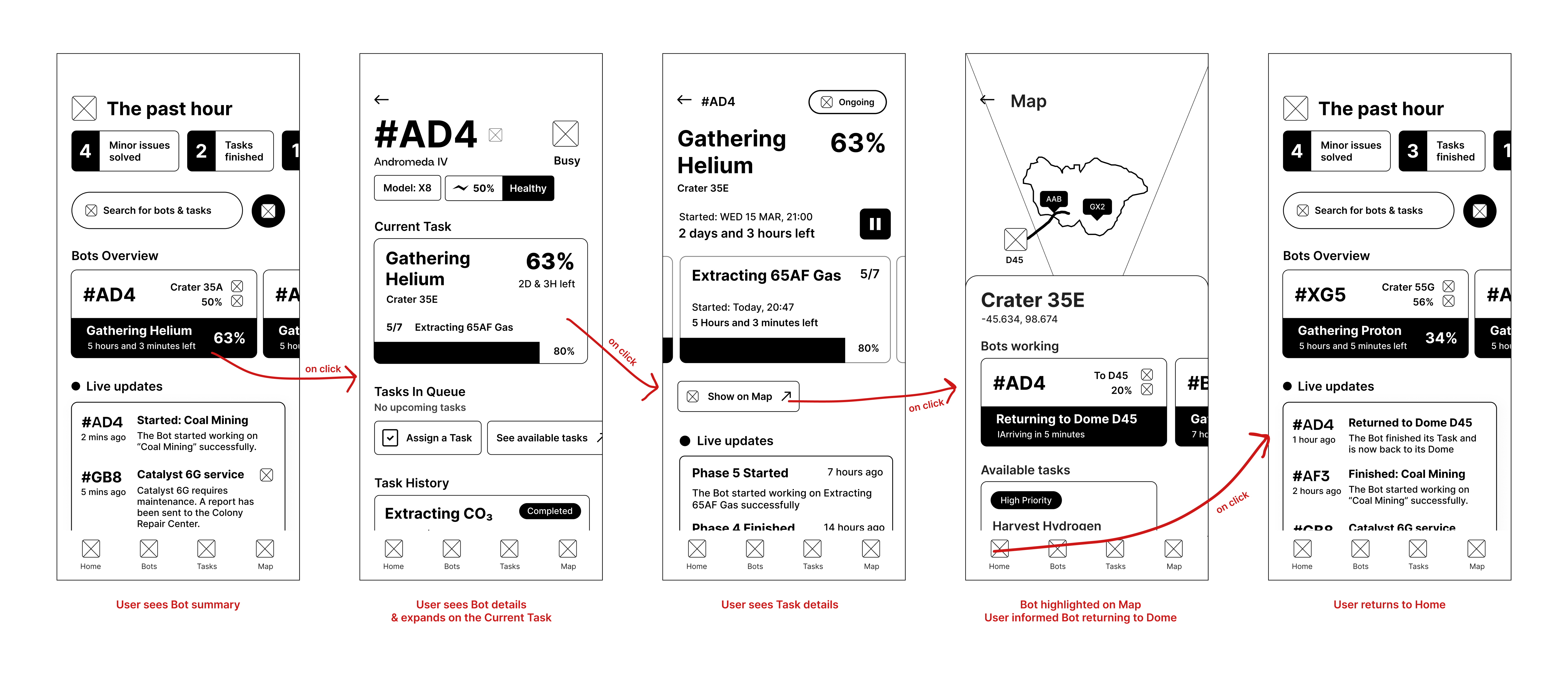
Participants were presented with a scenario about designing a given user flow showing how a user navigated through the app to complete a specific task.
1. The user opens the app
2. The user checks the status of the Hexabots
3. The user monitor a Hexabot’s progress assigned with a task
4. The user receives updates on the status of the Hexabot
The Data
The brief gave out all the information needed to have a complete picture of the app’s users personality along with their profiles, behavioral patterns and preferences, which really help speed up the design process.
✓ Real-time, easy-to-read status updates are crucial.
✓ Fast task assignment process with proper guidance can
significantly reduce user stress.
✓ Accessible interface: Users operate in challenging physical
conditions.
✓ Voice-activated task assignment and status checks could improve
usability.
✓ Providing options for customization could increase engagement
and usability.
✓ Clearly highlighting task locations and potential overlaps can
prevent confusion.
Timeline
Effective time management for project success was crucial. Hexa was created under time pressure, so every decision counted.
Data Processing: 20%
Thorough look at the available data. Extract every bit of useful information. Analyzing the meaning behind every sentence while grasping the whole project direction.
Results analysis: 40%
Conclusions based on the brief, categorizing information based on importance. I dug deeper into user personas in order to translate their wants and needs into design solutions that adapt to each case individually. Created a theoretical user flow indicating every necessary user interaction to reach the end goal and complete the brief’s user journey.
Design: 30%
Design of the Low Fidelity screens focusing solely on the user experience and navigation with no colors and placeholder text. It was the time to construct the base of the whole experience that would make or break the design. Following the instructions of the brief, a base was set that would solve all UX issues.
Refinement: 10%
Colors, typography and icons work together to elevate the Low Fidelity design and actually bring it to life while it approaches the closest it can get before the final production, by the programmers. In this final step, I had to create the UI part: the color scheme, the typography and the icon library while making sure everything fits aesthetically.
Low Fidelity - UX

Feature: Codenames
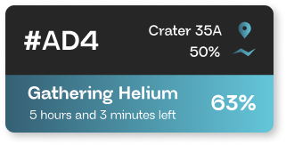
An integral part of a successful user experience in Hexa is based on fast Hexabot recognition and customization. Instead of using an image, “Codenames” uses a 3 character sequence or “Unique ID” in order to identify each bot in the app and during service support.

High Fidelity - UI

Space is dark and lonely,
Hexa doesn’t have to feel like that.
Colors
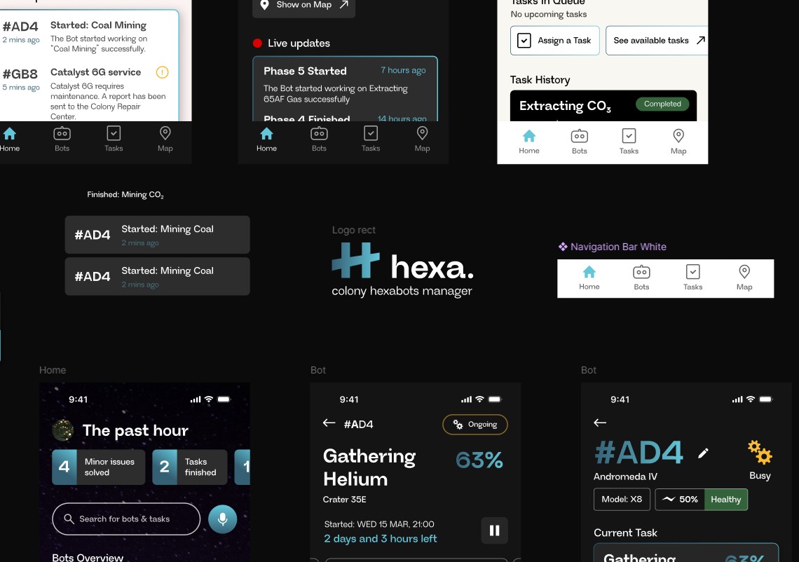
Futuristic but not extraterrestrial and somewhere between green and blue, the accent color helps push out the important information while keeping a sleek aesthetic and neutrality. The use of gradient is in style again but in a more serious and toned down style. Here, it’s used to indicate progress; starting from a darker hue and ending into a lighter tone, it implies movement and duration and since time management is our most important asset in this product, it should also be clear inside the app.
#356074
#64C6DA
Dark Mode
Blending in with the surroundings, dark mode follows the space’s dark tint in order to harmonize the user's eyes with the environment.
Typography
The key to an effective typography is to be readable while offering some variety. That’s why Neue Regrade was the optimal choice combining easy to read glyphs suitable for all text types (title, text, button) with a subtle futuristic character in their design.

Iconography
Icons convey meanings without text, that’s why they have to be as exact as possible. An icon that misses its definition can be misinterpreted, leading to unwanted results. That’s why in Hexa, icons were selected based on familiarity, respecting the fast pace while using the app; easy to understand icons are effective in faster user navigation and satisfaction.
Q&A
Four days was a really small time frame that made me value every second. Focusing on all the parts of the brief was crucial while figuring out the information hierarchy before everything else. I had to take decisions in a short amount of time while making sure everything looked and felt polished. I was anxious I wouldn’t have enough time to go through my whole analysis of the brief and my design would have gaps that the user could feel.
If I had more time, I would focus more on the actual user experience. Instead of taking so much time analyzing the brief, I would experiment more on how the user interacts with the interface and how the user scenario could become more fluent and aligned to the user’s persona. I feel like the navigation has some gaps and points where the user is not sure where to go next. So, having had more time, I would try to make a better use of the navigation experience and what parts of the brief are the most important for that.
Being my first ever participation in a UI/UX design competition with so many other honorable designers, I am proud that I even was a part of it. Having the jury go through my work, actually taking time to analyze every bit to see whether I would make it to top 40, made me very confident about my skills. Also, I am very fond of constructing such a interface is just four days! I really enjoying challenging myself for things I love and I would say I felt very relieved with the final results.
Reflecting back on this project, I see myself really focused and excited on this idea. Creating interfaces that are above all easy to use is something I really enjoy doing. Also, the brief’s idea was something I would never think of and it really pushed through my imagination. Overall it was an exciting but stressful experience that challenged my analyzing and designing skills to another level.