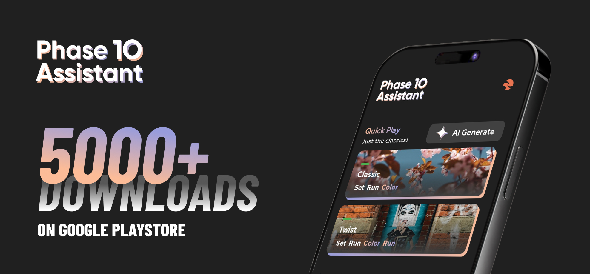
Phase 10 Assistant
Phase 10 Assistant is a unique approach on how you play Phase 10: the physical card game. UI/UX project that turned into an Android & Web app.


A new approach on card games
Phase 10 Assistant its all about elevating your current physical card game experience. Just some extra tools to make your Friday night with friends, even more fun!

see your score in every phase
See your phase, points and what you need to discard each phase. No more trying to find that paper where you wrote the phases! Sabotage the others by discarding cards they don’t want!
designed to give meaning to every game
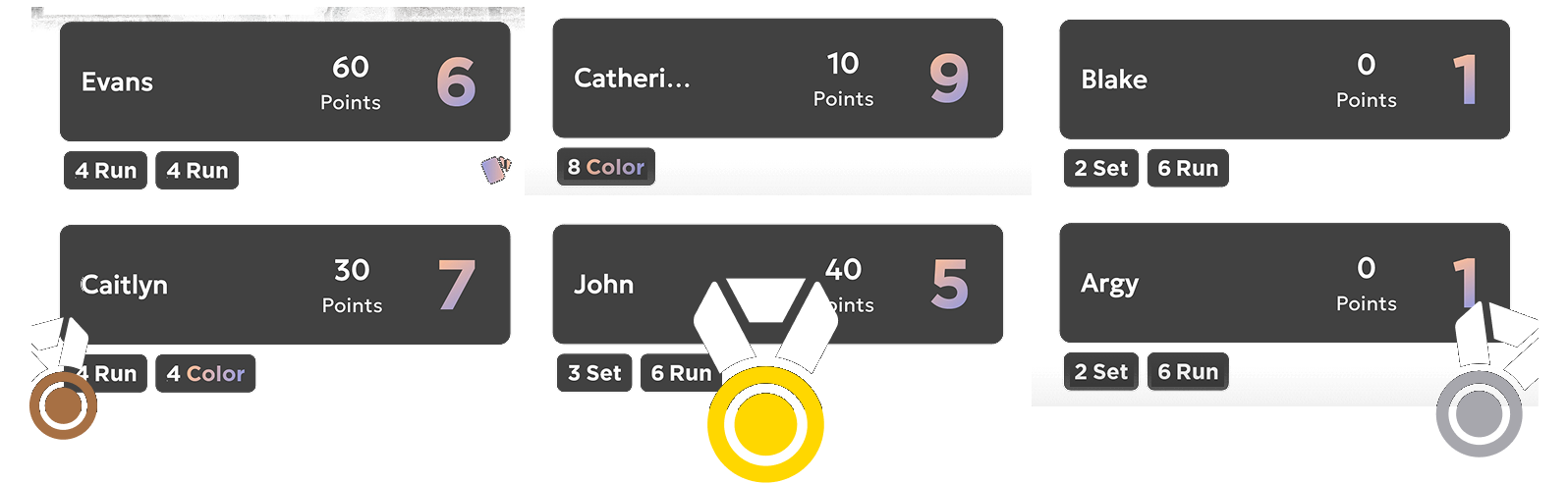
get competitive to claim the golden medal!

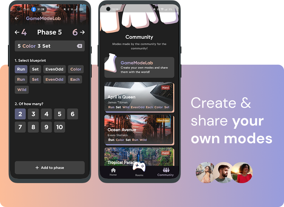
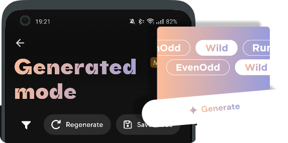
Experiment with Generated modes
Problem
Existing Phase 10 helper apps offer only rudimentary features, lacking enhancements that elevate the overall gaming experience. These applications often suffer from cumbersome usability due to poorly designed user interfaces and subpar user experience models.
Solution
Fresh and visually appealing aesthetic, incorporating game-suiting colors to evoke a sense of immersion and engagement. By integrating original user-focused features, the design aims to enhance the overall gameplay experience, fostering greater interactivity.
Typography & Colors
Title - 20pt
This is Gabarito
Heading - 30pt
Biiiiig Title
Input - 40pt
Phase 10 Assistant
#FCBC98
#989CDC
Icons
Shadow icons are used in larger scale and often alone. They can be
found in main pages and have a decorative means.
Gradient
icons work as a group and are easier to read. They exist in
buttons, context menus etc. and complete the meaning of text..
Target Audience
Phase 10 is a universally inclusive card game suitable for families and groups of friends. While appealing to a diverse demographic, the primary player base typically falls within the age range of 12 to 65 years. This demographic exhibits a propensity for critical thinking and strategic organization, attributes integral to success in the game. From a design perspective, this necessitates a user interface and navigation system that seamlessly accommodates players of all ages. Ensuring a universally accessible and enjoyable experience across this broad age spectrum is paramount to the game's design objectives.
Competition

Phase10 Counter
Giannis Alevizakis
Overall a very simple app that does its job very effectively with little to no bugs and is very easy to use and navigate. It doesn’t feature anything fancy, but it’s very user friendly and simple for new players.
+ The first and simpler app for calculating game points
+ Very simple user interface
+ Offers useful tools such as sort players according to their
place and game rules
~ Everything is represented by text, can get very tiring
~ Limited to the original game mode
~ Little information hierarchy - can create visual confusion

Phase 10 Scoreboard
Matrix_Developer
Well designed app but lacks in user experience. After using it a couple times, I couldn’t understand how most features work, which led to disatisfaction.
+ Interesting visual identity with bold colors and many visual
cues instead of text
+ Useful tools such as edit player points, skip phase and dealer
indication
~ Confusing navigation, lagging animations and overall poor user
experience
Because the market is still not saturated by this type of apps, there was still time to create a better product without sacrificing on features that have already been implemented by other creators. By examining the competitors, I was able to distinguish what the market needed as well as what could be improved from the existing products. Also, I could see their way of implementing different features and whether they were successful or not from the feedback they got, from Google Play reviews. In this way, a healthy competition is created where every product is benefited from its competitors and each creator tries to level up their product by trying to overcome problems and difficulties faced by the others.
Problem
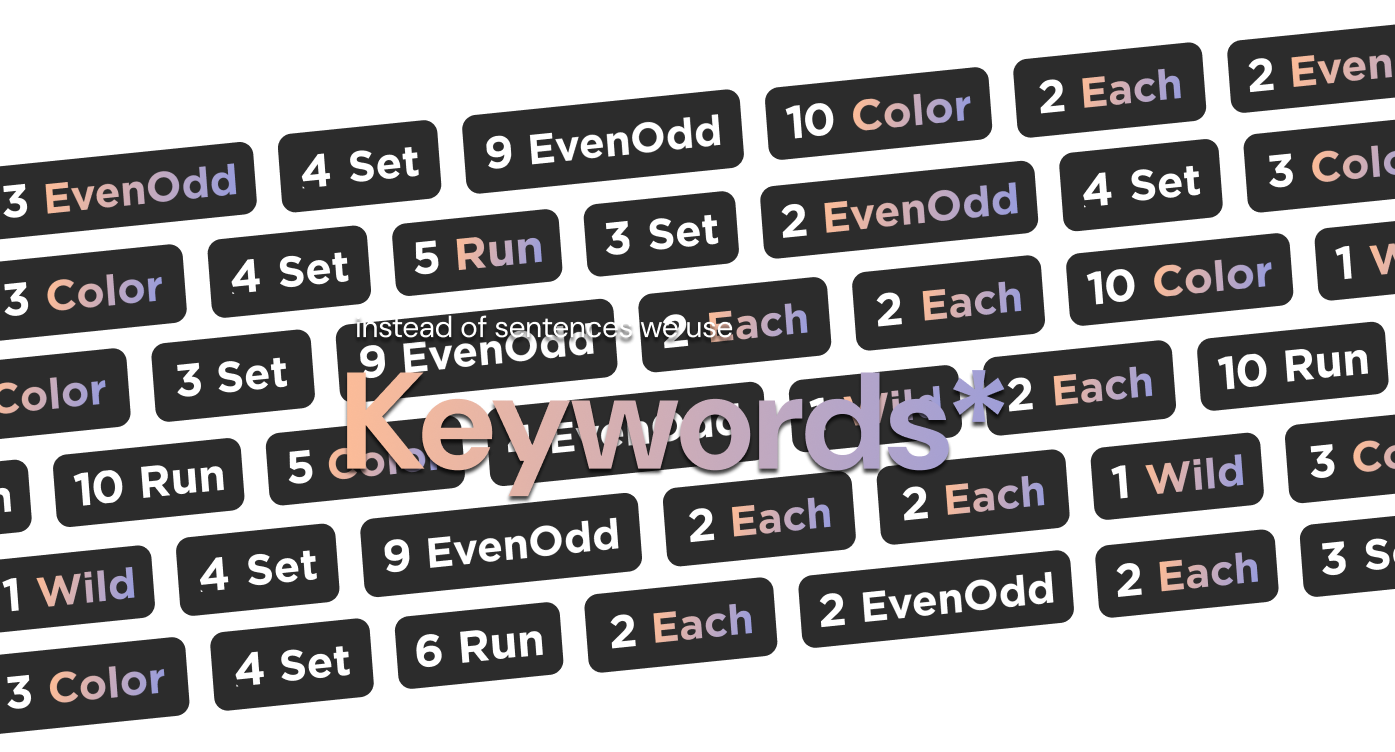
Every round’s objective is described by a small sentence showing which cards the player has to discard. The game’s official rules include a special card with small cards and numbers. While it is successful on print, it can often lead to interface clutter when it comes to digital applications. As humans tend scan, instead of reading, it was proven necessary to find a new way to show these objectives.
Solution
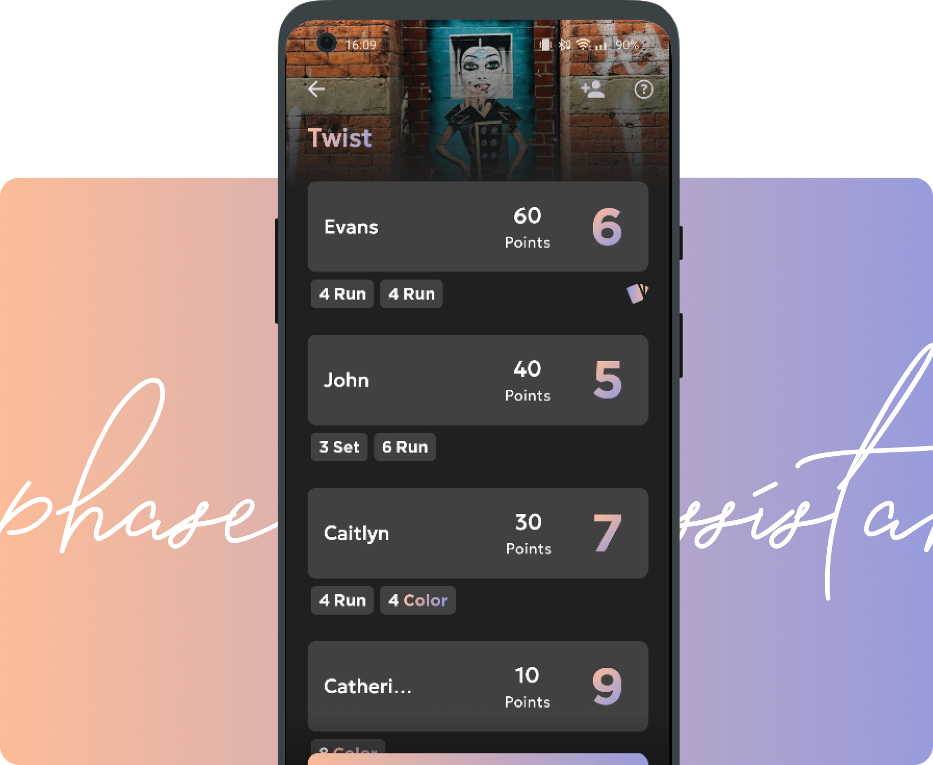
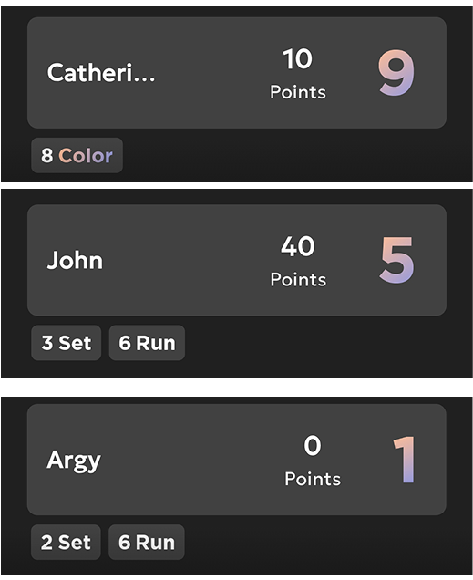
The solution came from the players’ feedback; it was focused on using a single word and a number to describe a while sentence. As the sentences used a special vocabulary, players were already familiar with some terms which were used in the new design system - called “Keywords”. These short codes break the objective is smaller ones by using three things: the special vocabulary, the existence or absence of color and a number.


Although at first hesitant, the players eventually got used to the new “keywords” system and found it surprisingly convenient especially when dealing with challenging objectives. This design system also allowed the introduction of a new unofficial “keyword” in the game. Instead of writing “2 numbers of each of the 4 colors” which can get really messy, the players are met simply with a colored “Each”.
A set of four and a row of three of the same color

As these sentences tend to become boring, it was necessary to depict the same meaning with a different means. That’s why with these “keywords”, these phrases got simplified down to a number and a word. The sentence above can very easily be written as 4SET & 3COLOR while maintaining the same meaning
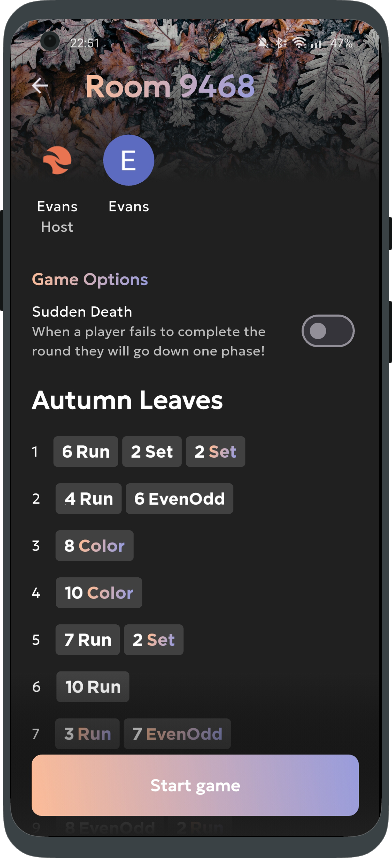
Problem
Before the game starts, a player has to be the one that takes down the score, as in many other physical card games. In Phase 10, at the end of each round, apart from points, a special variable, which indicates the player’s objective for the next round and counts towards their victory, has to be taken down. When many players are playing the game, this can lead to errors and confusion as this variable has change many times for every player throughout the game.
Solution
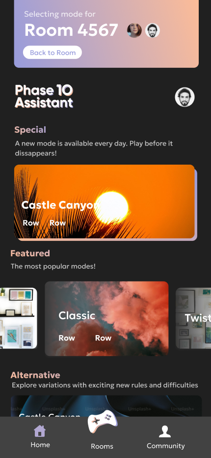
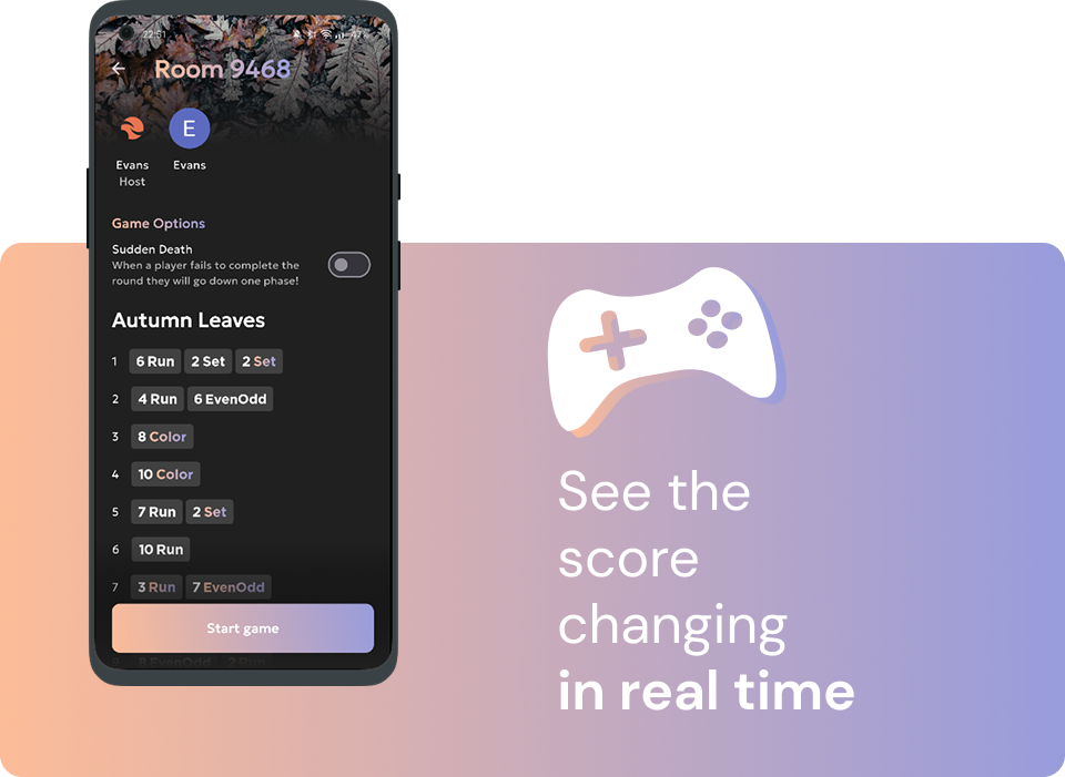
With the “Rooms” feature, every player can take down their score from their own device. A host player can select a game mode and create a Room which the other players can join through a mutual server. From there, everyone can only change their own score at the end of each round while seeing their co-players score.
An Extra Takeaway
In order to improve the overall user experience when using
Rooms, players would first join a Room and then vote which mode
they would like to play, instead of having a host which decides
from the start, and has to re-create a room if the player’s
choose another mode.
While in paper, this sounds a
great idea, in reality it creates some major user experience
issues. The app’s structure focuses on the different types of
available game modes, each of them belonging to a specific group
according to ts creation parameters (who created it, how long it
will be available, mode familiarity etc.).
In order
for the players to select a mode after entering a Room, all
modes would have to be unified into one page where the players
would select their desired one. Problem rises in the unification
model which would confuse users about each mode’s category. All
modes would look the same and the users would find it extremely
hard to find their desired mode.