Some things may look outdated. An updated visual identity is on the way!
BA Thesis about converting a fresh app idea into reality. With less than 6 months to complete, this projet is a truly extended approach on UI/UX. Together is all you need to gather with your friends!

The trailer 🎞️
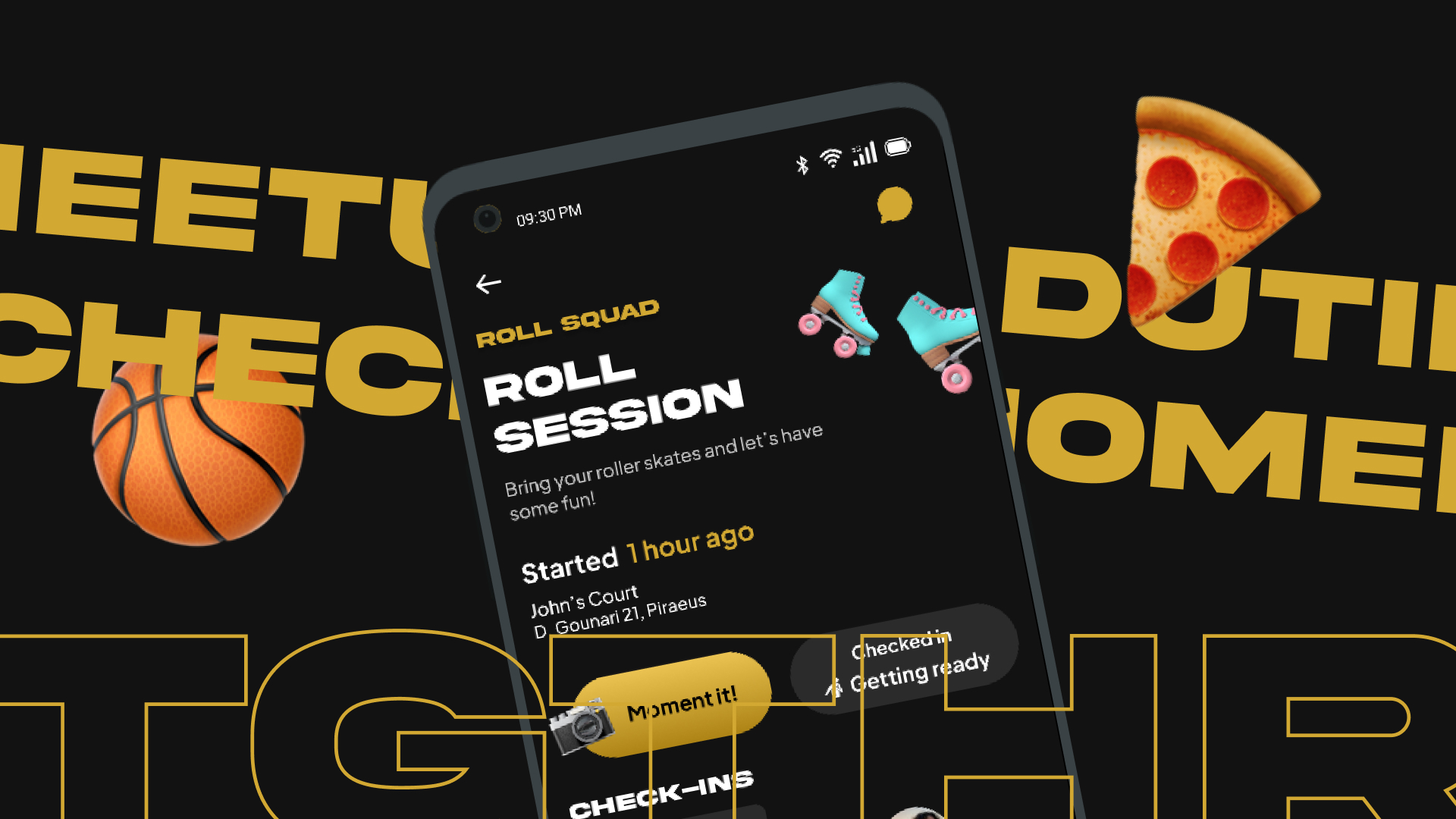
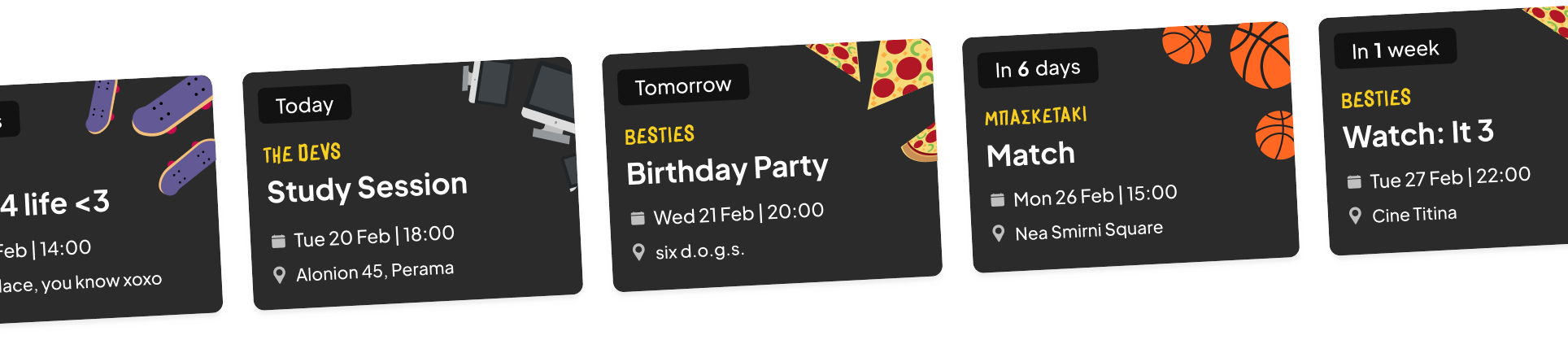
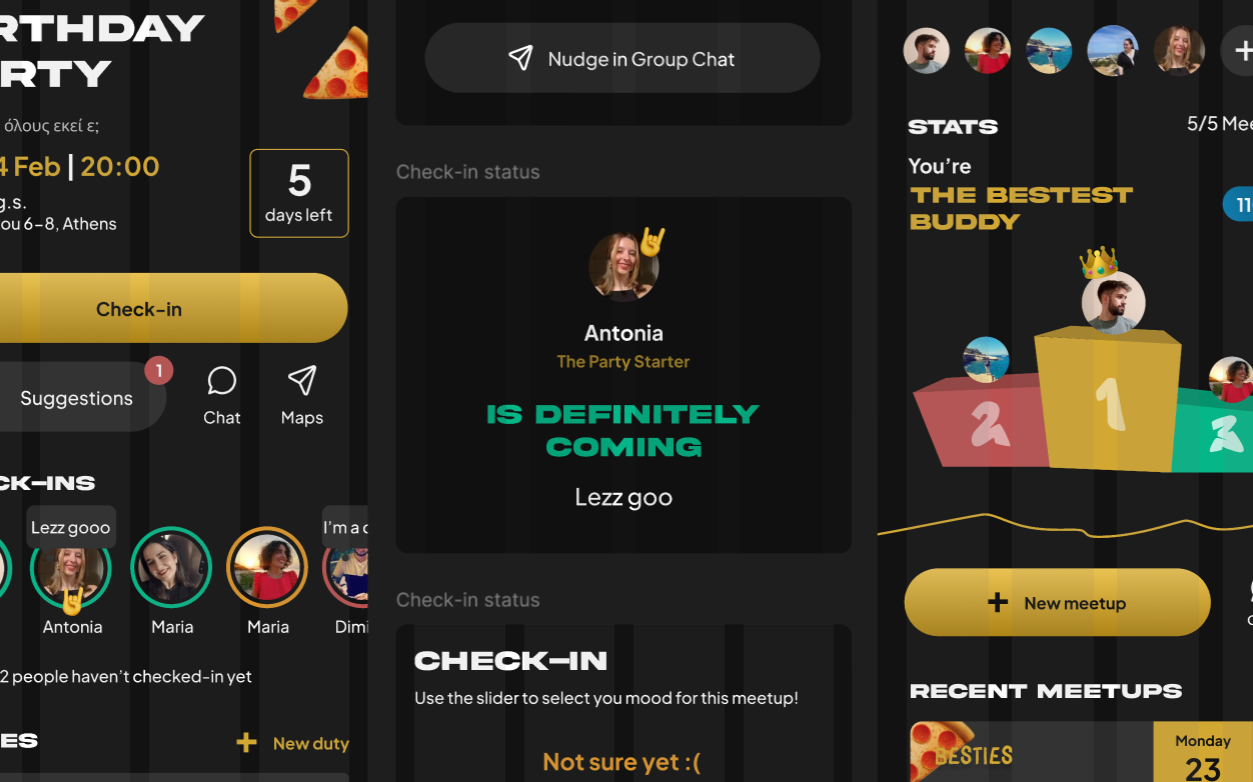
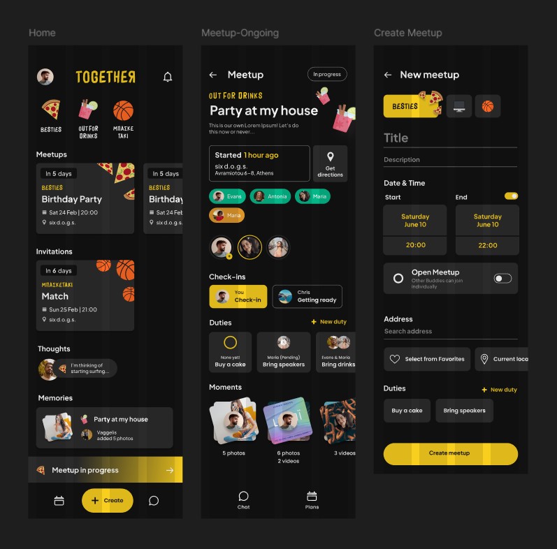
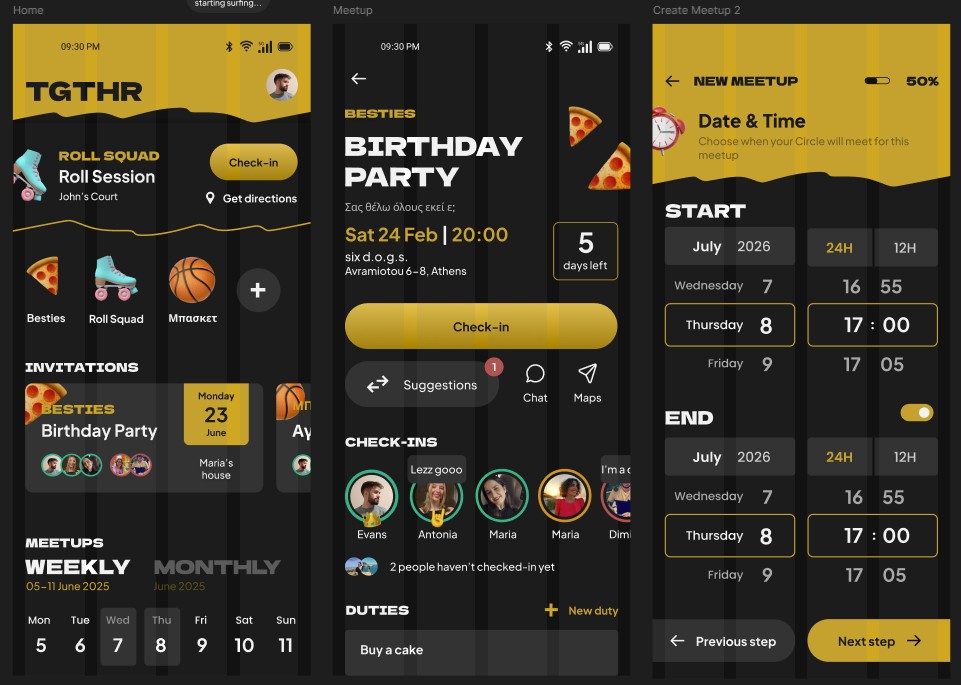
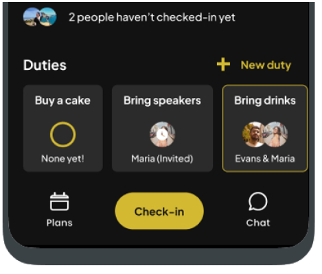
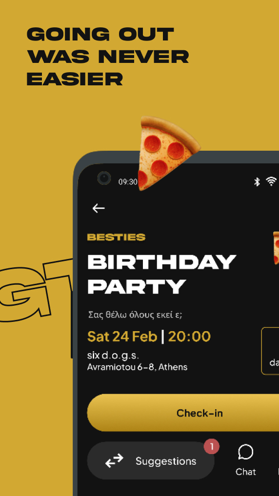
Organized Meetups 🤝
Your meetups in one place, no more lost in endless group chats!
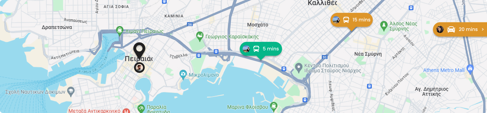
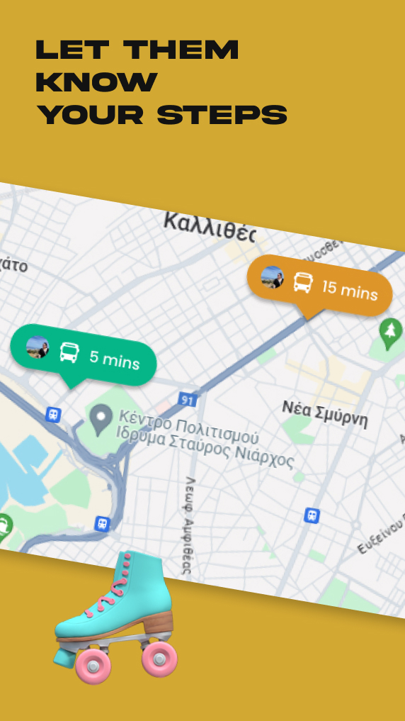
Share your live location 👀
Let your friends know where you are and how much time will it take to arrive
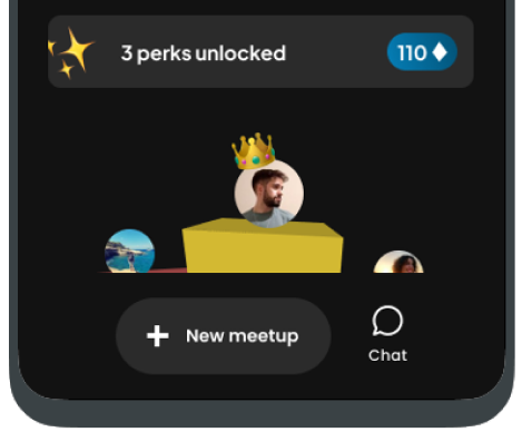
Compete for the 1st place! 🏅
Gather Activity Points by being active to earn exclusive Perks!
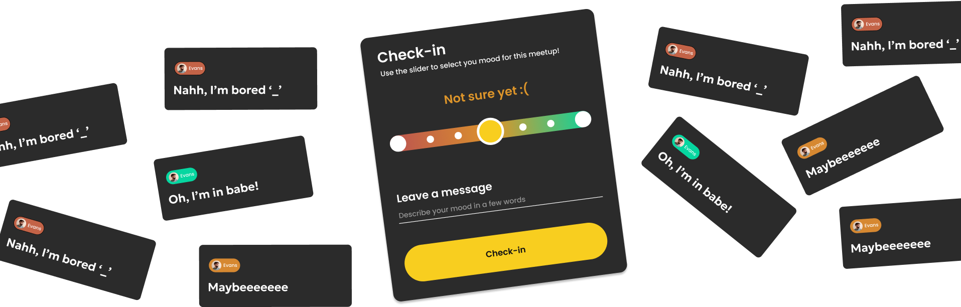
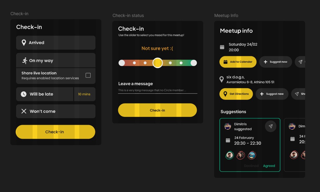
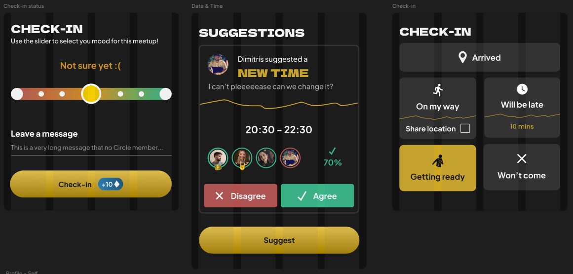
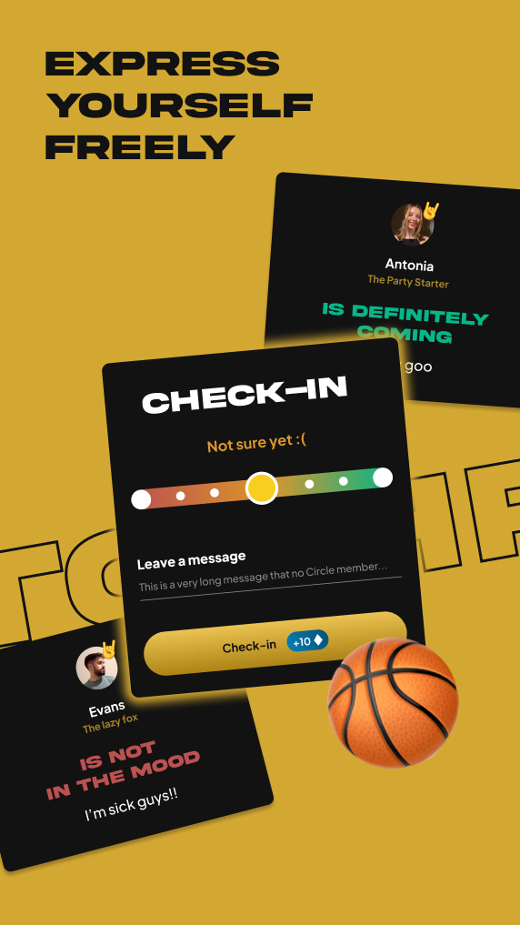
Your mood out loud 😄
Let your friends know where you are and how much time will it take to arrive.
Behind the Project
Problem
This app helps groups organize meetups orderly.
Organizing a meetup through chat can become very tedious
when everyone proposes their own thing. Some people don’t
respond at all, some work and don’t show up at all. The group
chat is flooded with questions and you scroll endlessly to find
the one picture your friend took of you.
Solution
Together is the visual interpretation of a group chat. Instead of long messages and constant scrolling, your friend group can now see everything at a glance when organizing a meetup. Just propose and let everyone else express their opinion, within their own time frame.
Influence: Social Media
Social networks have become an integral part of the daily lives of a large population of people around the world. But not everyone belongs to the same category. According to the Pew Research Center, users over the age of 30 prefer to use Facebook and YouTube more than Snapchat and Tiktok which seems to appeal to younger generations. Accordingly, the use of social networks decreases as people age. In the United States of America, 84% of young people aged 18-29 say they use social networks on a daily basis, while only 45% of people over 65 seem to do the same. (Atske, 2021)
According to this data, some conclusions can be drawn regarding the general character of social networks and what needs they cover. Some social networks, such as Facebook and Twitter, were launched during the first years of public availability of the Internet. Consequently, the rules, both functional and design, have adapted to the times and the available technology. Initially, they were aimed at a young audience with few tools and customisation options while trying to become known and enter the everyday life of the average user by creating a new habit. However, as technology evolved, new platforms emerged, taking advantage of new technologies. To compensate for its share of the global market, Facebook introduced more and more features too often, leading to the phenomenon of Social Media Fatigue. Users, overwhelmed by a very high pressure, started to get tired and sought new simpler platforms such as Snapchat (Bright et al., 2015)
But why were these platforms left behind? The key elements they focused on were few but clear and new-to-market tools and a simple user experience. Companies understood that young and relaxed users bring in much more revenue than existing users, so they started to create new platforms that were clearly targeting new generations. Fresh colours, soft movements and interesting typography were the main means of attracting the interest of the new generations. In addition, they started to follow the laws of user experience, rules that set the basis for the maximum user experience of an application. Nowadays, creating an application was not just in the hands of one or a group of developers but needed a special new approach related to the user's satisfaction while using the application. (Frier, 2021)
User Personas
🏆
The Competitor
This type of person is the life of the party. They will attend every meetup you create and will be the first to organize everything from a simple night out to a house party with dozens of guests. They want a way to organize their meetups as they are so many, they often lose track.
🐺
The Lone Wolf
This type of person doesn’t go out that much, has a small friend group but makes every moment count. They value small gatherings and making memories. They need a place to inform their friends of their rare meetups and make sure they don’t forget.
🛋️
The Couch Potato
You usually find this person sleeping. It doesn’t matter if you call them, text them, show up at their house, they will always have an excuse to why they don’t answer. Their friends need a way to hang out with them, this type of person can get very funny and open once surrounded by people!
Design
Screens
Between the Thesis and today there have been many iterations that ultimately improved the user interfae. After deep research on UX, some necessary changes where made in order to meet better the expectations of the user for the app.
First iterations on paper
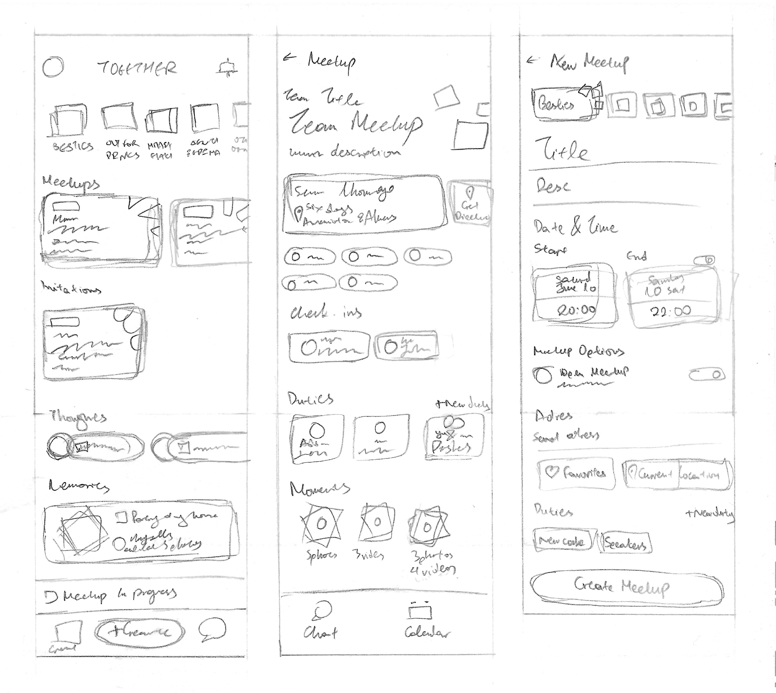
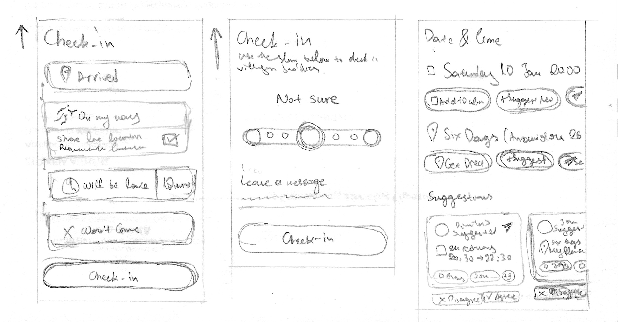
Thesis
Re-design
Thesis
Re-design
UX Tactic: Dynamic Navigation Bar
Dropped in later designs due to unnecessity.
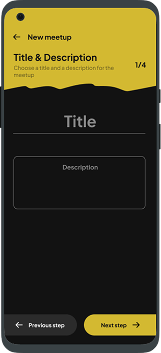
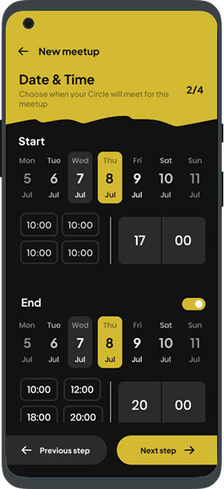
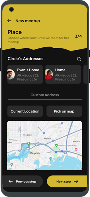
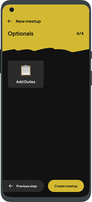
Meetup Screen Sequence
Goal-Gradient Effect
“Provide a clear indication of progress in order to motivate users to
complete tasks.” - lawsofux.com
Promotion
Character
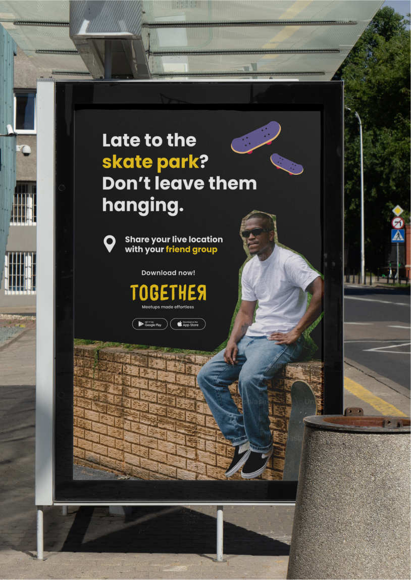
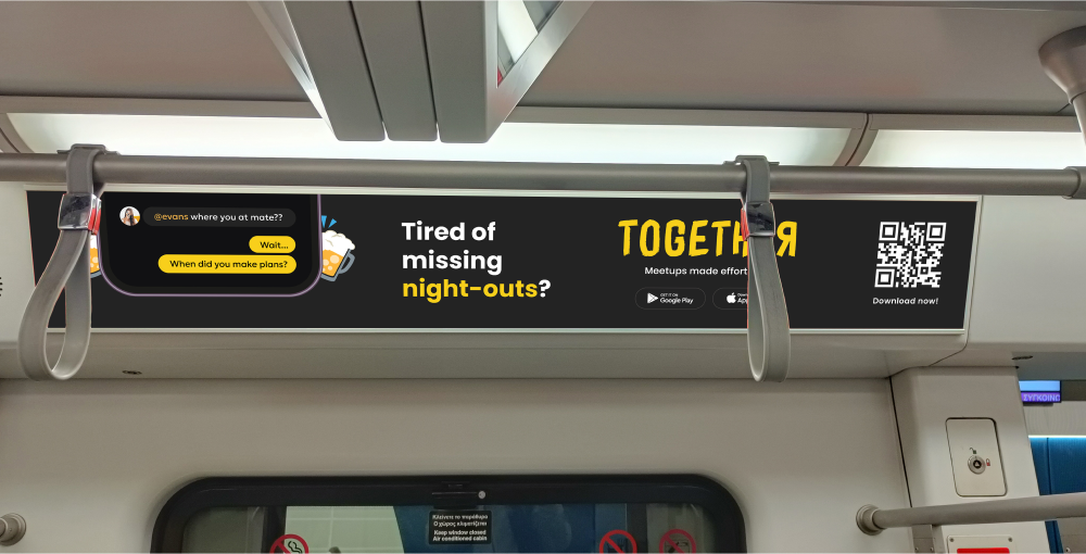
The character of the promotion of an application is influenced both by the target audience and the design choices of its identity. In Together, as the target is a young audience, the use of humor and directness is chosen in order to express a freer spirit which also follows the brand identity of the product. The content of the promotional applications initially describes in a few words a problem which, depending on the medium, may be accompanied by a complementary image. The solution is then proposed through a function of the application and finally the viewer is invited to install the application, as the final purpose of the promotion. In general, the advertising of the app is largely aimed at raising the emotional awareness of the viewers, a successful practice often used in the world of promotion.
Typography
The rules of typography change in relation to the digital application as the promotional media are governed by different operational rules and have a different end goal. In promotion, the information hierarchy wishes to communicate a problem and then propose a solution in that order while intensifying the user's attention so that the promotional medium is both perceived and understood.
Color
In promotional applications, colour has a strong role in terms of aesthetics and attractiveness. attractiveness. As in the digital application, the combination of dark tones with yellow gives a intensity through contrast and attracts the viewer's eye. Finally, the colour palette remains simple since it is complemented by the image element creating a complete aesthetic and colourful environment
Promotion
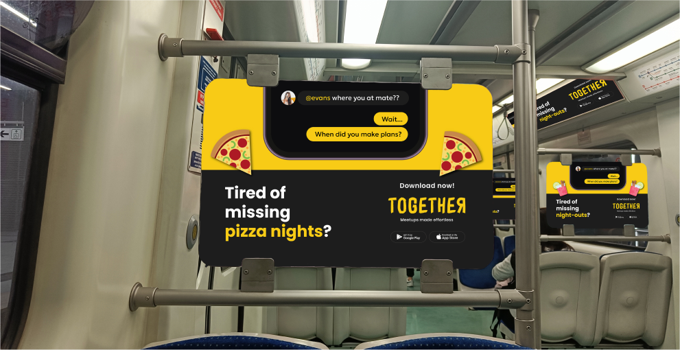
The choice of promotion is related to the nature of the digital applications and the audience to which they are targeted audience. For this reason, specific choices have been made, such as the bus stop or the metro, places where young people are more likely to be moving around and other media such as magazine advertisements are not used. The use of other media such as magazine advertisements has not been used as young people are not familiar with these media. In addition, the character and content of the advertisements was adapted to each medium in order to the maximum readability and clarity of the information. Thus, in the subway advertisements, no space is allocated to the The advertisements in the metro ads did not use images, but only icons and a photo of a mobile phone in order to make it immediately accessible to the public. that the advertised product is a digital application. Images tend to create visual noise and to such an extent as in the case of the metro it was considered that it would be difficult to read of the other information in the advertisement
Another approach was taken by online advertising. As the time a user spends looking at advertisements is minimal, the advertised product should be so clear that it can be recognized at first glance in a fraction of a second. Thus, in this case too, the use of images was not used, but rather the direct presentation of the application screens was preferred.
The use of humour
Humour is an integral part of Together’s advertising campaign and
it is heavily based on its targeted age group. It is a fresh
approach that really captivates the freedom and youthfulness that
comes with the street language spoken by the young people and
works as an effective means of getting closer to their needs and
way of living.
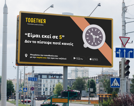
In the billboard example, the sign writes:” ‘I’ll be here in 5
minutes’ - None ever even believed it“, which is a very common
phrase when organizing a meetup. Using an annoying situation that
happens very often as a problem, implies that the advertized
product, in this case the app, can help deal with it or reverse
it. Consequently, by utilizing a common oral everyday phrase,
Together is able to communicate its purpose, without writing
exactly how it helps, inviting the ad spectator to dive more into
the product.
Conclusion
Together is a digital application that wants to solve a problem that is faced on a daily basis, the inability to organize meetings between friends. Through specific tools and validated design practices, it leaves nothing to chance but adapts its user experience according to its users and according to the laws of UX. All design elements have been used to maximize usability that will ultimately contribute to the success of the app. In addition, the design identity is completed through the promotional applications which aim to promote the application through the most appropriate ways and the most ideal means.
Resources Used
• Atske, S. (2021, April 7). Social media use in 2021. Pew Research
Center.
https://www.pewresearch.org/internet/2021/04/07/social-media-use-in-2021/
• Bright, L. F., Kleiser, S. B., & Grau, S. L. (2015). Too much
Facebook? An exploratory examina tion of social media fatigue.
Computers in Human Behavior, 44, 148–155.
https://doi.org/10.1016/j.chb.2014.11.048
• Cuello, J., &
Vittone, J. (2013). Designing mobile apps. José Vittone.
https://books.google.gr/books?hl=en&lr=&id=nQBJAQAAQBAJ&oi=fnd&pg=PA11&dq=visual+language+in+mobile+apps&ots=yvr8PCDyAo&sig=zsuYwIeSy9gpJRCX9WQf6Mth2lE&redir_esc=y#v=onepage&q=visual%20language%20in%20mobile%20apps&f=false
Frier, S. (2021).
• Maybray, B. (2023, July 11). Color
Psychology: How To Use it in Marketing and Branding. HubSpot.
https://blog.hubspot.com/the-hustle/psychology-of-color
•
Wheeler, A. (2017). Designing Brand Identity: An essential guide for
the whole branding team. John Wiley & Sons.
• Yablonski, J.
(n.d.-a). Design principles for reducing cognitive load. Laws of UX.
https://lawsofux.com/articles/2015/design-principles-for-reducing-cognitive-load/
•
Yablonski, J. (n.d.). Home. Laws of UX. Retrieved July 2, 2024, from
https://lawsofux.com/
• Zhang, J., Sagar, S., & Shihab, E. (2013,
August 19). The evolution of mobile apps: An exploratory study.
Proceedings of the 2013 International Workshop on Software Development
Lifecycle for Mobile. http:// dx.doi.org/10.1145/2501553.2501554
•
Bean, D. (2019, March 6). The dark side of dark mode: Is the latest
app trend sucking the life out of our screens? Observer.
https://observer.com/2019/03/dark-mode-app-trend-psychological-effects
Further Reading
Hooked: How to build habit forming products | Nir Eyal
No filter: The inside story of instagram | Simon and Schuster